

Responsive Web Design Introduction
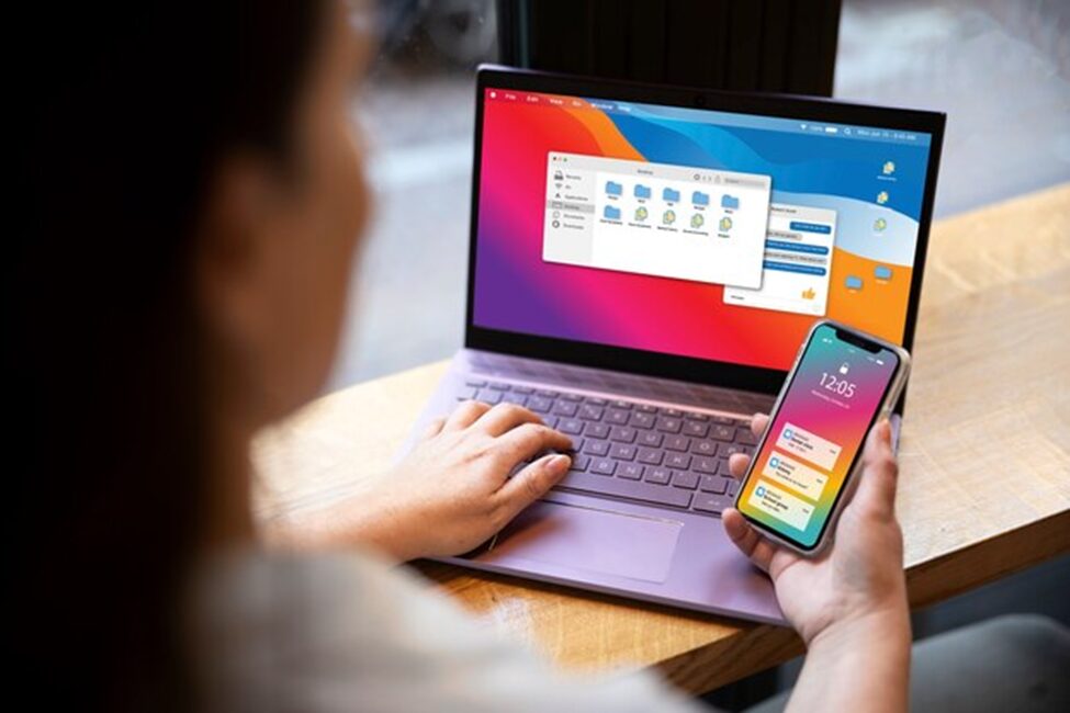
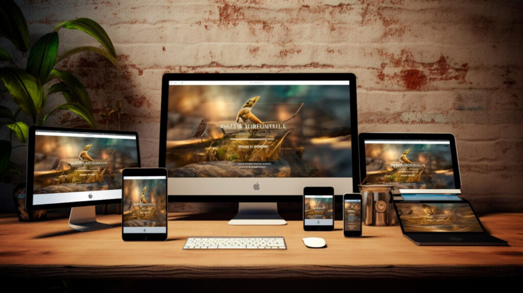
Responsive Web Design is a new design approach that ensures your web designs will respond to the user’s screen size and platform. That means the user will receive an optimal viewing experience across all devices, computer sizes and phones. This is achieved through the features of this web design that can adjust the content and layout for the user’s device. This functions automatically, the user or the designer doesn’t need to make separate versions of their web designs.
Responsive Web Design Key Features
There are four main features of Responsive Web Design:
- Fluid & Flexible Grids – A fluid grid or a flexible grid is a feature of RWD that helps the layout of your web to adapt to different screen sizes.
- Flexible Images – Flexible images are a feature that helps images resize smoothly to fit various screen sizes and resolutions of your web page.
- Media Queries – This works for applying different styles to a website depending on the user’s device size and resolution in RWD.
- Viewport Meta Tag – This feature controls how your web page is displayed on different devices and mainly works as an instructor for the browser to adjust the page’s scaling and dimension.
Responsive Web Design Techniques
For a consistent and user-friendly experience across different devices, RWD uses these techniques:
- Grid Layouts – To organise content consistently and appealingly by providing a structured framework is the way of Grid Layouts in responsive web design.
- Fluid Typography – Fluid typography ensures optimal readability across all devices by adjusting the font size based on the viewport size.
- Breakpoints – This is another technique that helps RWD by maintaining layout consistency across various devices; they are predefined points to change your website’s layout and style to accommodate different screen sizes.
- Responsive Images – Images specially optimised to adapt to different viewport resolutions and sizes are called responsive images as well as flexible images.
- Flexbox and CSS Grid – To control the spacing and arrangements of items for a one-dimensional layout we have Flexbox. Meanwhile for two-dimensional layouts for both the column and row control within a grid container, we have CSS Grid.
- Mobile-First Design – It’s an approach where the design process of creating a layout with a user-friendly experience for mobile devices first.
Responsive Web Design Tools
Tools and Frameworks that help the RWD to work properly:
- Bootstrap – It’s a tool designed by Twitter (X) for simplifying the designing of responsive websites. This tool allows developers to create responsible and flexible layouts.
- Foundation – To help developers and designers create mobile-first websites and applications Zurb developed this framework.
- CSS Grid Layout – In the CSS (Cascading Style Sheets) systems, CSS grid layout is a strong layout to create complex web layouts more easily and proficiently.
- Media Query Tools – For testing and implementing responsive web designs Media Query tools are here; Viewport Resizer, Responsinator, Browserstack, Screefly etc.
Responsive Web Design Best practices
Recommended guidelines and strategies are the best practices of RWD that help developers create websites efficiently.
- Mobile-First Design – For essential content and functionality it’s necessary to design the website for smaller screens first then enhance the larger screens.
- Real Devices Testing – It’s important to regularly check and test the website on real devices to ensure the consistent behaviour and appearance of your responsive web page.
- Images & Media Optimisation – Test the responsiveness of all images, videos and other media on your web page by using CSS properties.
- Simple Layout – Simplicity is necessary, don’t complicate anything for you with a complex layout. Using a grid view is also helpful as it’s easier to place elements on the web page.
- Use Relative Units – For your responsive web pages, it’s better to use relative units like percentages. Pixels are fixed units that aren’t easy for your grid view.
- Code Bloat Minimisation – Including unnecessary and not required code in the website software, making perform slow with increased file size is what code bloat is. It’s necessary to minimise code bloat for a better and faster performance of your website.
Pros & Cons
There are many pros and benefits of responsive web design. Yet at the same time, there are cons and challenges of RWD:
Pros –
- One of the key benefits of RWD is its improved user experience.
- It helps with better SEO rankings.
- You can reach a boarder audience with this.
- It makes it easier to maintain multiple site versions.
- You will experience a faster and smoother loading time and performance.
- It’s crucial for business success.
- It’s cost-effective and can give better analytics.
Cons –
- It’s a challenge to design a navigation system that works well for all devices.
- Optimising the site for more devices and sizes of the screen is hard.
- Making sure that the website works consistently across all browsers.
- Scaling images while making sure their clarity does not decrease.
- Doing responsive web coding yet making sure the page doesn’t take much time to load.
Future Web Design Trends

To meet the demands of new technologies and user expectations, Responsive Web Design is developing these future trends:
- Progressive Web Apps (PWAs) – These are applications to design a native app-like experience across websites, to work offline and even load quickly.
- AI and Machine Learning – These aspects can help responsive web design by making layouts based on user experience and personalising content.
- CSS Container Queries – CSS grid, flexbox and container queries respond to the viewport size by allowing modular and adaptable design components.
- Variable Fonts – Typography which is versatile and efficient on the web and can adjust properties to enhance website performance and design flexibility.
- No-Code & Low-Code – Creating websites quickly is now possible with the no-code and low-code platforms.
Responsive Web Design has become a crucial web development in the world. There are many benefits of it, yet challenges are not few either, however, with the prospects of our future new technologies and user expectations RWD is essential.
Enhance Your Digital Presence with Devgraphix
At Devgraphix, we specialize in creating responsive web designs that ensure your website looks stunning on any device. Our team of experts leverages the latest techniques and tools in RWD to provide seamless and engaging user experiences. Whether you’re a small business or a large enterprise, we tailor our web solutions to meet your specific needs, helping you reach a broader audience and improve your online visibility.
Contact us today to discover how we can transform your website with cutting-edge responsive web design and take your digital presence to the next level.